neo-brutualism-art
Today’s rant won’t be much about tech but instead it’ll be touching user interface side of the world that I somehow care about (ಠ⌣ಠ).
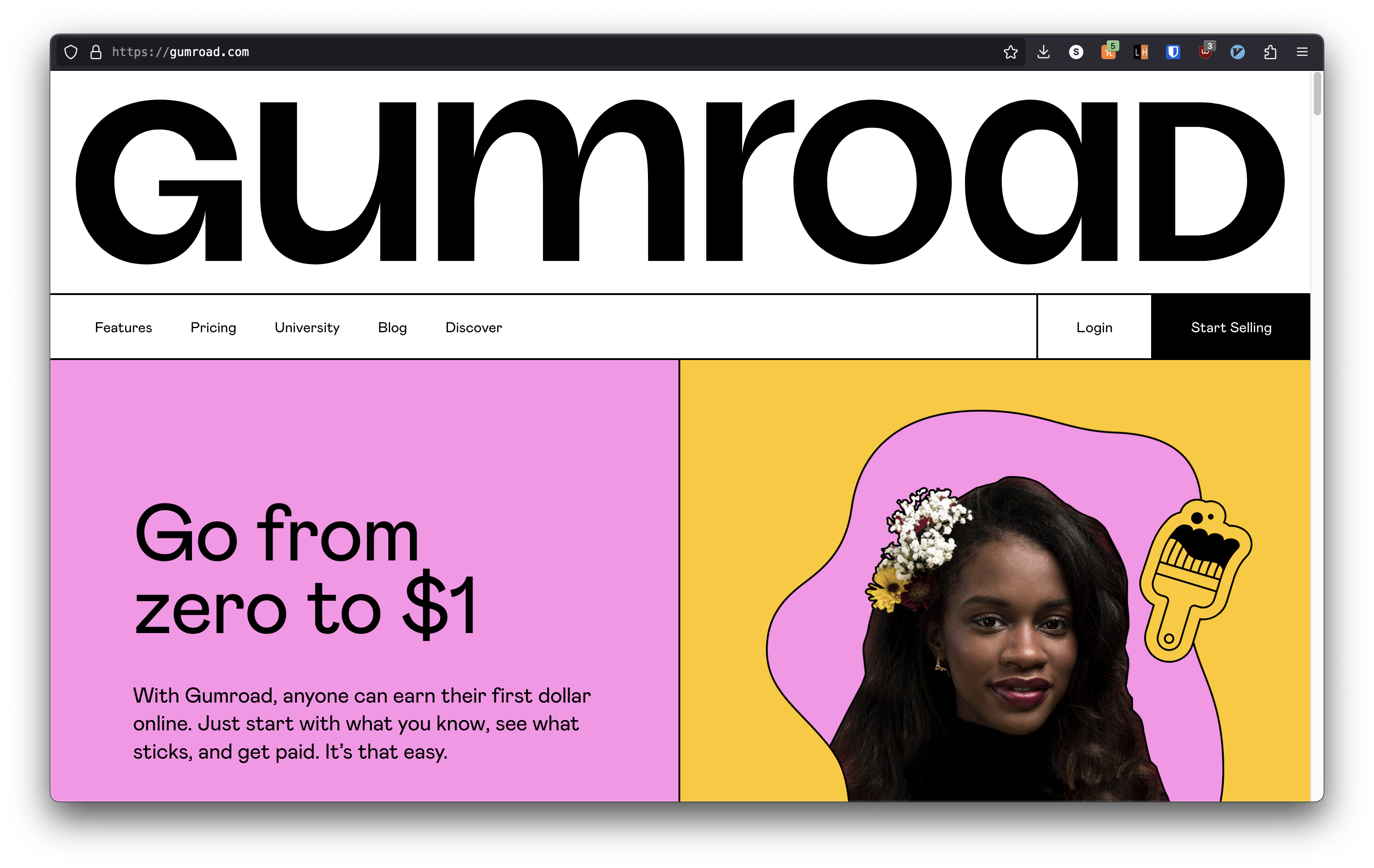
Very recently I stumbled across a unique niche of art called Neo-Brutualism or Neu-Brutualism. I would be calling it Neo Brutualism for the rest of the rant. I don’t consider myself as a very colorful or artistic of a kind, personally I have an eye for monochromatic consistent look or how exactly an old engineering wiki page resembles like. I would prefer the first born reddit UI anyday over websites which might look bombarded with hardcore visuals which would look appealing at the first glance but could be taxing after frequent visits like kprverse to which I have no hate, kudos to the frontend team. Anyways, enough rant about how I like things, I would come back to the the topic of where I first saw the concept of Neo-Brutualism, I came across gumroad to get my hands on a wallpaper pack where I noted the peculiar or should I say unpredictable color pallete of the website with the bold elegant choice of typography.
and that led me to learn more about this design concept. So I wasn’t aware what kind of style it is so I took a screenshot of the website; reverse searched the image leading to pinterest, where much wasn’t discovered but a lot of interesting concepts of brutualism concept was portrayed in context of architecture that is to say:
